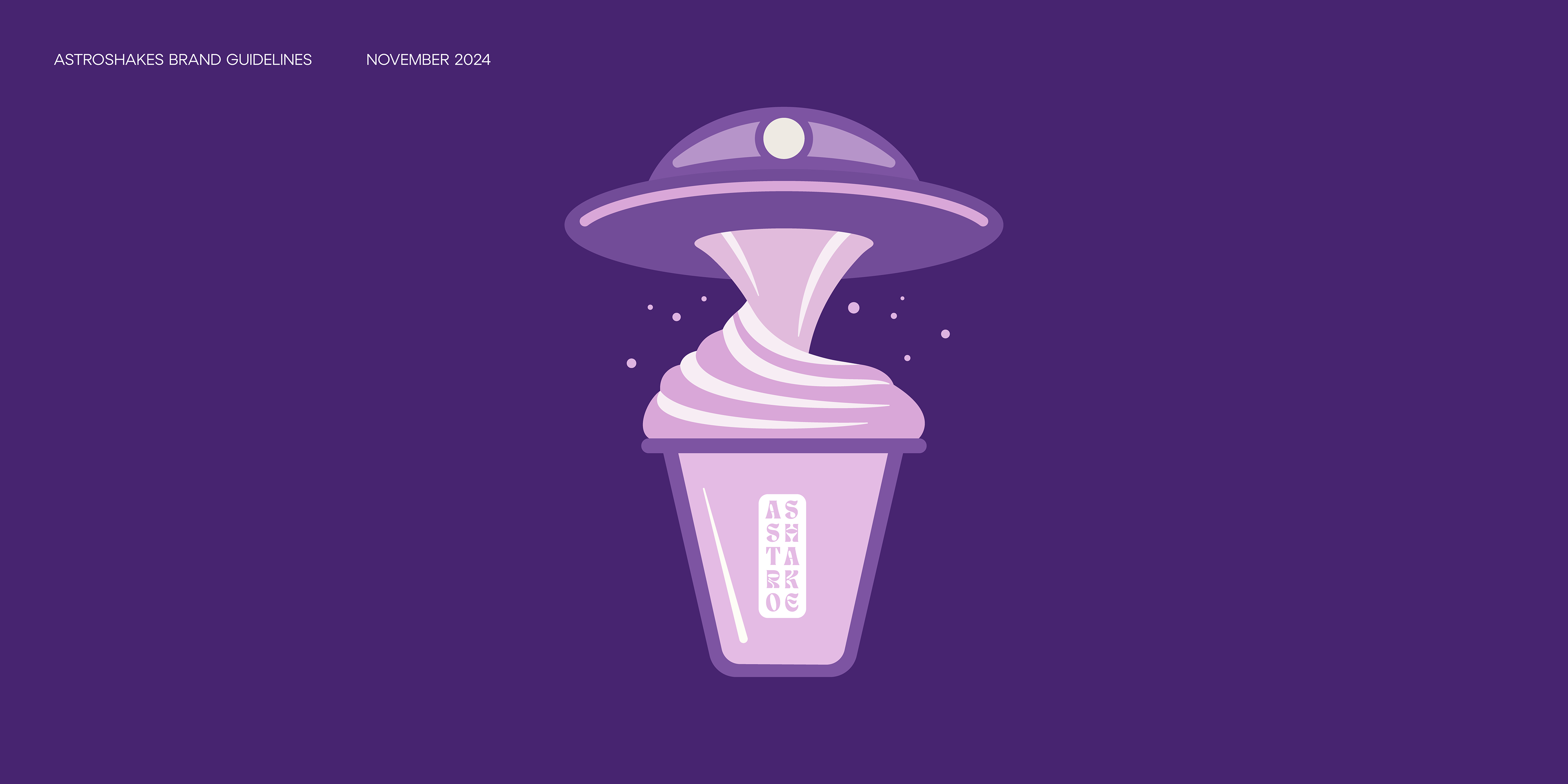
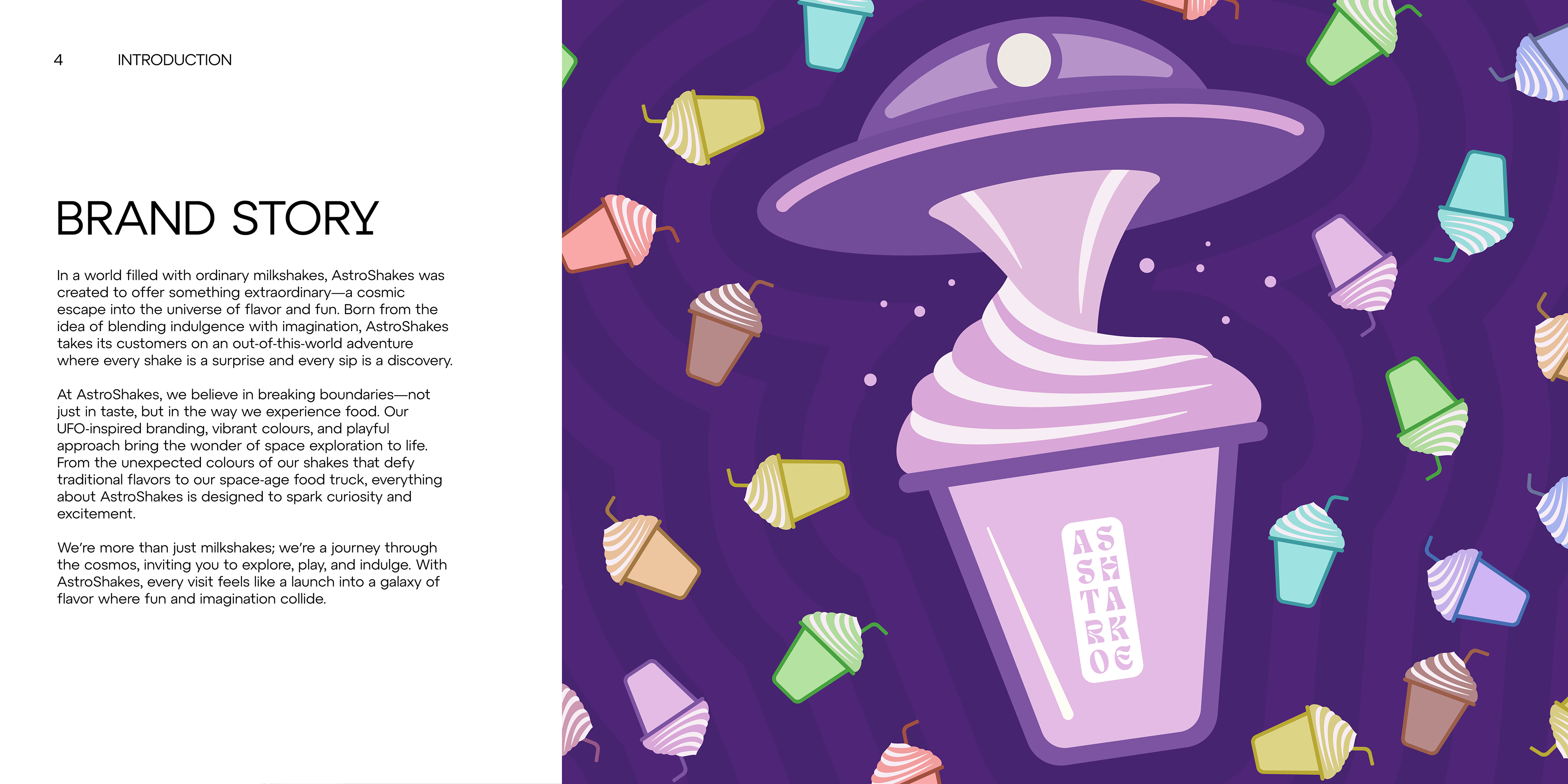
The AstroShakes brand was designed to capture a futuristic, space-inspired dessert experience through a clean and minimal visual identity. The logo combines playful curves and circular forms to subtly echo planets and orbital motion, while the bold yet friendly typography reflects a modern, retro-futuristic feel. A vibrant color palette — grounded in deep space tones with pops of cosmic accents — enhances the brand’s energetic and imaginative tone. Supporting graphics like stars, planetary rings, and swirling shake motifs reinforce the celestial theme across all touchpoints. Overall, AstroShakes balances creativity and clarity, offering a brand experience that feels fresh, fun, and out of this world.